
Yes, there are more ways than one to look at a stock chart.
I often hear comments about investing from those who are interpreting stock charts incorrectly. Let me show you what I mean. Here is a standard chart of the S&P 500 index from 1950 to 2010.
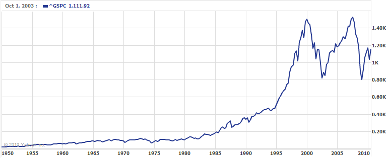
Source: Yahoo! Finance on 9/29/2010
Based on a chart like this, it’s easy to conclude that:
- The returns from 1985 to 2000 were significantly higher than the returns from 1950 to 1985.
- The returns since 2000 have been far more volatile than any time since 1950.
In fact, if you chart almost any stock, mutual fund or index over a long period of time, it will have this basic shape: a very flat curve initially, then a rapid increase in the most recent period. Seeing this pattern repeatedly, it is easy to conclude that this is a property of stock prices. Unfortunately, what you are seeing is just a quirk of typical stock charts.
Let’s look at the S&P 500 chart again, but this time after changing one setting.
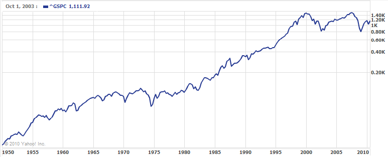
Source: Yahoo! Finance on 9/29/2010
Using this version of the chart, the conclusions above seem to be technically correct, but certainly not to the same degree. Returns and volatility look to be far more steady over time.
What’s the difference? The first chart is built using a linear scale, while the second one uses a logarithmic scale. Uh, let me try again. A linear chart graphs differences in value equally, so a 100 point change today (about a 10% change) would look the same as a 100 point change in 1985 (about a 50% change). Meanwhile, a logarithmic chart graphs percentage differences equally, so a 10% change today (about a 100 points) would look the same as a 10% change in 1985 (about 20 points).
Let’s compare these two with a simple example: an investment that grows by 10% each year for 50 years. A linear chart would show an initially flat curve that increases dramatically at the end. A logarithmic chart would show a straight, upward sloping line. Which is visually more representative of a steady 10% return?
Next time you pull up a stock chart on Yahoo or Google, remember to use a logarithmic chart to avoid overemphasizing recent returns.
thanks for the insight. I’ve never thought to switch to a logarithmic view when I looked at charts so knowing this def helps going forward. question though…how come some sites such as google finance doesn’t just set its default chart view as logarithmic? in other words, what’s the value in looking at the linear scale if it doesn’t truly represent historical behavior?
good thing is, I use yahoo finance for most of my chart viewing, and their default view is logarithmic!
I don’t mind that Google and others use linear charts by default. Otherwise, they would have a lot of confused users expecting a standard linear chart. I believe both Google and Yahoo allow users to set their own default setting, so you only need to set it once.
Linear charts are fine for short-term performance without material changes in value. But if you’re looking at decades of performance, the distortions in a linear chart make it very misleading.